

Color theory books help you choose palettes, understand why hues work together, and make art or design decisions with more confidence. Without a clear guide, color choices can feel arbitrary; online tips often offer isolated tricks without explaining how color relationships shape the whole picture.
For those gaps, a color theory book offers a practical place to learn. Clear explanations connect concepts such as hue, value, contrast, and harmony, while examples show how to apply them in paintings, layouts, and everyday creative projects.
Many books include color wheels, exercises, and visual comparisons, so you can see how small changes affect a palette. Lessons on mixing, temperature, and contrast help you make more deliberate choices and build skills at your own pace.
Books differ in depth, format, and focus, from beginner-friendly introductions to detailed guides for working artists and designers. Explore the best color theory books below to find a useful guide for your creative goals.
8 Best Color Theory Books Reviews
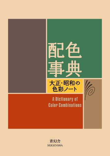
1.SEIGENSHA Color Combinations Vol 1 Book
Japanese edition presents color combinations for visual reference

2.Ilex Color Theory for Artists Guide
Learn how color works and apply it to your art and creative projects

3.Yale Interaction of Color 50th Edition
See how colors interact and shift in appearance with their context
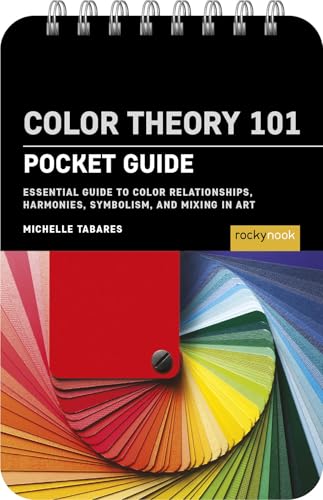
4.Rocky Nook Color Theory 101: Pocket Guide
Learn color relationships, symbolism and mixing for your art practice

5.Watson-Guptill Color Choices Guide
This used book helps readers make sense of color theory and choices

6.Tarcherperigee Color by Betty Edwards
This used book teaches a course in mastering the art of mixing colors
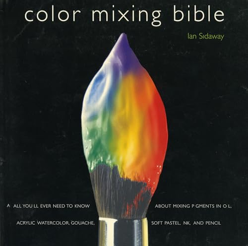
7.Watson-Guptill Color Mixing Bible for Artists
Guide to mixing pigments across oil, watercolor, acrylic and more

8.Phaidon Press Flower Color Guide Book
Compare flower colors and palettes with this visual reference guide
1. SEIGENSHA Color Combinations Vol 1 Book
SEIGENSHA’s A Dictionary Of Color Combinations Vol 1 gives readers a compact reference for exploring color pairings. The Japanese Edition focuses on combinations rather than a broad discussion of color theory, making it a visual resource for people who want ideas to consult while planning creative work.
The title identifies this as the first volume in a series of color-combination references. Its subject can help designers, illustrators and other makers compare palettes and consider how different colors work together in a project.
The Japanese edition is an important detail for buyers choosing a book they can read comfortably. The product data does not specify the language of any text beyond the edition label, so readers who need explanations in a particular language should check that before buying.
At about 5.9 inches tall, this book is small enough to keep near a desk or carry with other creative materials. It weighs about half a pound, so it should be easy to move between a workspace, classroom or studio.
The listing gives no page count, binding details or explanation of the color systems inside. Buyers looking for a full instructional guide may want to confirm the book’s contents first, while those seeking a portable reference on color combinations may find its focused subject useful.
For readers building a color-theory library, this volume suits designers and hobbyists who want a small, Japanese-edition reference centered on color combinations.
- Focuses on color combinations for palette ideas
- Compact, about 5.9 inches tall for desks
- Weighs about half a pound for portability
- Japanese edition may not suit every reader
2. Ilex Color Theory for Artists Guide
For artists who want to understand how colors work together, Ilex’s Color Theory for Artists offers a book focused on working with color. Its title signals a practical subject for people developing their use of color in art.
The book’s small format is about 8 inches tall, making it a compact option to keep beside a sketchbook or art materials. At about 1.2 pounds, it is also light enough to carry along when you want to read or refer to it away from home.
Its subject can help artists think about color choices while they work on paintings, illustrations or other creative projects. Readers looking for a book devoted to color theory can consider it as a focused addition to their art references.
The Amazon listing does not provide details about the book’s chapter topics, format or included exercises. Buyers who want to compare its specific lessons with other color theory books may need more information before choosing.
The listing gives no page count or binding details, so those points are not available for comparing how much material the book contains or how it is presented. Its title and compact size are the main details provided.
This book suits artists who want a portable, color-focused reference and are comfortable choosing from limited listing information.
- Focuses on color theory for artists
- Compact, about 8 inches tall
- Weighs about 1.2 pounds for portability
- No major cons
3. Yale Interaction of Color 50th Edition
50th Anniversary Edition gives readers a compact illustrated book focused on color theory. “Interaction of Color” is the title, and the anniversary edition makes this a choice for readers looking to explore color through an illustrated format.
The listing identifies Yale University Press as the publisher. Its illustrated presentation gives the book a visual format for readers studying color ideas, rather than a text-only listing. The product data does not describe the specific topics or exercises inside.
At about 9 inches tall and 6 inches wide, the book is small enough to carry or keep beside a desk. Its listed weight is about 1.1 pounds, so it should be manageable to hold while reading or consulting it.
The title identifies this as a 50th anniversary edition, which may interest readers seeking this particular edition of “Interaction of Color.” The data does not specify how many pages it contains, so buyers should check the listing or edition details if page count matters.
This is a focused pick for people interested in color theory and an illustrated book format. It suits students, artists and curious readers who want to explore a book whose title centers on the interaction of color, while those seeking details about contents may want to confirm them before buying.
- Illustrated format gives color theory a visual focus
- About 1.1 pounds for manageable reading
- Compact size is easy to carry or store
- 50th anniversary edition for interested readers
- No major cons
4. Rocky Nook Color Theory 101: Pocket Guide
Artists who want a compact introduction to color theory get a pocket-sized guide to color relationships, symbolism and mixing. Color Theory 101 is part of The Pocket Guide Series for Artists, and its title points to three useful topics for exploring how colors work together.
Color relationships can help readers compare hues and consider how different combinations affect an artwork. The guide also covers symbolism, a topic artists can use when choosing colors to communicate ideas or set a mood.
Mixing is another subject named in the title, making this book relevant to artists who want to think about how colors combine. The available details do not specify its examples, exercises or depth, so readers looking for a particular teaching style may want more information.
At about 5 by 3.5 inches, the book has a small format that can fit in a bag or sit beside a workspace. It weighs about 0.2 pounds, so carrying it with art supplies should add little weight.
Rocky Nook publishes the guide for artists, and its pocket format puts the subject matter in a portable reference. It may suit artists seeking a small book on color relationships, symbolism and mixing rather than a large-format art textbook.
- Covers color relationships, symbolism and mixing
- Pocket size is easy to carry around
- Lightweight at about 0.2 pounds
- No details on examples or exercises
5. Watson-Guptill Color Choices Guide
At a desk or bookshelf where color theory books are read and referenced, Color Choices: Making Color Sense Out of Color Theory offers a multicolor book for exploring the subject. The title focuses on making sense of color theory, so it may suit readers looking for a book centered on understanding color.
The book’s 8.35-by-10.94-inch format gives its pages a broad, nearly letter-size footprint. That leaves room for comfortable reading and for keeping the book open while comparing colors or consulting it during a project.
At about 0.43 inches thick, it has a slim profile that takes up little shelf space. Its weight of about 1.3 pounds also makes it manageable to carry between a home workspace, a classroom or a library.
The multicolor listing makes the book’s color-focused subject visible in its presentation. The supplied details do not specify its page count, edition, binding or the particular topics it covers, so buyers who need those details may want to check the listing before choosing it.
Amazon identifies this copy as used and in good condition. That gives readers a lower-waste option than buying new, though used books can show signs of prior handling.
Readers seeking a book specifically titled around color choices and color theory may find it a useful addition to a reference shelf. It suits students, artists and curious beginners who want a compact book on the subject and are comfortable buying a used copy.
- Nearly letter-size pages offer room to read
- About 1.3 pounds makes it easy to carry
- Used copy in good condition can cost less
- Used condition may show signs of handling
6. Tarcherperigee Color by Betty Edwards
Mixing colors is the subject of *Color by Betty Edwards*, a book for readers studying color theory through hands-on color mixing. Its title makes the focus clear: it is a course for learning about mixing colors.
The listing identifies this as a used book in good condition. That gives buyers a stated condition to consider when choosing a copy, though the data does not describe its pages or cover in more detail.
At about 1.4 pounds, the book is a manageable size to hold while reading or keep on a desk for reference. Its purple color is also listed in the specifications.
The book’s compact format suits readers who want a physical color theory title they can keep nearby as they study. The listing provides no further details about exercises, illustrations or the specific topics covered.
For readers choosing among color theory books, the title points to a focused guide rather than a broad survey of the subject. It may suit people who want to explore color mixing, while buyers seeking particular contents should check the book itself.
- Focuses on color mixing for theory study
- About 1.4 pounds for desk-side reading
- Used copy is listed in good condition
- Listing gives few details about the contents
7. Watson-Guptill Color Mixing Bible for Artists
Watson-Guptill offers artists a guide to mixing pigments across a wide range of media. The Color Mixing Bible covers oil, acrylic, watercolor and gouache, along with soft pastel, pencil and ink.
That breadth makes it relevant to readers who work in more than one medium, or who want a single reference for exploring different materials. The book focuses on color mixing, a useful subject for artists choosing and combining pigments.
Its title also signals that the guide deals with pigment mixing rather than color theory in general. Buyers looking for a book on this specific skill may find its range of media especially useful.
The book weighs about 1.1 pounds, so it is a manageable option to keep near a work area or carry between places. Its black cover gives it a simple, dark appearance.
The listing names Ian Sidaway as the author and describes the book as a guide for artists. The available details do not specify page count or the depth of its instruction, so readers may want to check those before buying.
For artists seeking a pigment-mixing reference that spans several media, the Color Mixing Bible is a focused choice. It may suit beginners and experienced artists alike, especially those who use oil, watercolor, acrylic or other listed materials.
- Covers pigment mixing across seven art media
- Includes oil, acrylic, watercolor, and gouache
- Also covers pastel, pencil, and ink techniques
- No major cons
8. Phaidon Press Flower Color Guide Book
With the compact Flower Color Guide and its focus on flower colors, this book gives readers a portable reference for exploring color relationships in floral subjects. Its title suggests a flower-centered approach to color theory, which may suit readers interested in applying color ideas to botanical imagery.
The book weighs about 1.6 pounds, so it can travel in a bag for reading at a desk, in a studio or while working with flowers. Its compact format also makes it easier to keep nearby as a reference than a large, heavy book.
At about 7 inches tall, it takes up little shelf space and can sit beside other art or design books. The slim profile is useful when you want a guide within reach without setting aside much room.
The supplied details do not list the book’s topics, examples, page count or specific color exercises. Readers who want to compare the guide’s coverage with other color theory books may need to check those details before buying.
Phaidon Press publishes the guide, and its title points to flowers as the subject for studying color. That focus may appeal to artists, designers and flower enthusiasts who want a compact book connected to botanical color.
As the roundup’s final choice, it suits readers looking for a small, flower-focused addition to a color theory library. Its listed facts confirm a portable size and manageable weight, while buyers seeking a broad account of color theory should verify the book’s contents first.
- Compact size takes little shelf space
- About 1.6 pounds for portable reading
- Flower-focused topic for botanical color study
- No major cons
How to Choose the Best Color Theory Books
Choosing a color theory book is easier when you match its lessons to your goals, art materials, and reading habits. Language, page design, color reproduction, and price all shape how useful it will be.
| If You Need | Look For | Expect |
|---|---|---|
| Color basics | Clear explanations and examples | Less depth on specialized methods |
| Painting guidance | Mixing exercises for your medium | More focus on practical technique |
| Quick reference | Compact size and organized pages | Smaller text and fewer examples |
| Color inspiration | Many palettes or visual examples | Less step-by-step instruction |
| Study activities | Exercises and guided practice | More time needed to work through it |
| Several art materials | Coverage of your specific media | Broader advice, less medium-specific depth |
Learning Goals
Start with what you want the book to help you do, because color theory books range from introductions to focused references. Beginners often benefit from clear explanations of hue, value, saturation, and color relationships before tackling advanced exercises.
If you want to mix paint, look for lessons that connect color theory to pigment choices and practical combinations. Designers may prefer examples of palettes and visual relationships, while illustrators may need both concepts and exercises.
A reference book suits readers who already know the basics and want ideas while working. A course-style book asks for more time and attention, but its exercises can help turn reading into repeatable skills.
Medium Coverage
Art materials behave differently, so choose a book that addresses the medium you use most. Paint mixing guidance for oils may not transfer directly to watercolor, while colored pencils, ink, and pastels have their own limits.
For a single medium, seek examples and instructions that name it clearly, especially if the book teaches mixing. If you work across several materials, broader coverage is useful, though each medium may receive less detail.
Look for practical discussion of how pigments combine, not just color wheels or general theory. Readers who mainly choose digital colors need examples about relationships and palettes, rather than instructions centered on physical paint.
Exercises And Teaching
Exercises give you a way to test ideas, so look for prompts that ask you to compare, mix, or arrange colors. Beginners often learn more from a simple task with a clear aim than from dense terminology alone.
A structured course suits readers who want lessons in an order, while open-ended examples work better for dipping in and out. Before buying, consider whether you will set aside time to complete activities rather than only browse.
Some books emphasize observation and visual judgment instead of recipes, which builds skills that transfer between projects. That approach suits learners willing to experiment, but readers seeking exact mixing directions should prioritize step-by-step demonstrations.
Color Reproduction
Printed color is affected by paper, ink, and screen or lighting conditions, so a page cannot always match the color you see in your materials. Treat swatches as visual guidance, not guaranteed paint formulas.
For palette books, look for clearly separated combinations and enough surrounding context to understand how colors relate. Strong visual organization helps you find ideas quickly, while tiny samples can make subtle differences harder to judge.
If accurate comparison is central to your work, use the book alongside your own material tests. This matters especially when matching a particular pigment or finished surface, since printed pages cannot show every medium’s texture or sheen.
Page Design And Size
A small book travels easily and suits quick reference at a desk or studio, but compact pages may limit diagrams and make text harder to read. Larger layouts give illustrations more room, though they take up more space.
Check the dimensions and weight against how you plan to use the book. A lightweight guide fits a bag or workbench, while a heavier volume may be more comfortable as a home reference than a book carried daily.
Page structure also affects how quickly you can find information. Clear headings, labels, and an index help during a project, while a visually rich layout may inspire browsing but take longer to search.
Language And Edition
Confirm the edition’s language before ordering, particularly when a title is listed in more than one edition. A book in a language you do not read may still offer visual inspiration, but explanations and exercises will be harder to use.
Also consider whether the terminology matches your experience. Beginners often need plain definitions and examples, while experienced artists may prefer concise explanations and less introductory material.
Edition details can signal changes in layout or included content, but do not assume a newer edition is automatically more useful. Compare the stated language, format, and description with your learning needs before choosing.
Portability And Use
Think about where the book will be used, since a studio reference and a travel companion have different needs. A compact guide is easier to carry, while a larger book offers more space for diagrams and examples.
If you plan to keep it beside paints or other supplies, consider its size and how the pages are arranged. A quick-reference format helps during short sessions, but a course book may work better at a table.
For a gift, match the format to the recipient’s habits and available storage. Someone who enjoys browsing visual examples may value an illustrated book, while a learner who wants structured practice may prefer lessons and exercises.
Condition And Durability
For used copies, review the seller’s condition notes and photos when available, especially for pages with color examples. Missing, marked, or damaged pages can reduce the value of a book used for study or reference.
A book handled in a studio faces more wear than one kept on a shelf. Consider whether the binding and page condition suit frequent opening, and use a separate surface if paint or water is nearby.
Paper and binding details are not always listed, so avoid assuming a particular construction from a brief listing. If you need a book for regular workshop use, prioritize a clean, intact copy over cosmetic perfection.
Price And Value
Lower-priced books often provide a focused introduction, a compact reference, or a used copy, while higher prices may reflect larger formats, extensive illustrations, or more detailed teaching. Compare the actual content with your intended use.
Paying more makes sense when the book covers your medium, offers useful exercises, or will serve as a reference for years. If you only need palette ideas, a concise visual guide may be enough.
For used listings, weigh the discount against condition and edition details. A low price is less attractive if pages are damaged or the language is unsuitable, while a well-preserved copy can offer lasting value.
Choosing Your Fit
Before ordering, compare the book’s stated subject, format, language, dimensions, and condition with the way you plan to learn. These details reveal whether it is a lesson book, a visual source, or a desk reference.
Choose one main purpose instead of expecting every book to cover theory, mixing, and inspiration equally. Matching that purpose to your skill level and art materials makes the purchase more useful from the first session.
Frequently Asked Questions
Do these color theory books need batteries or a power source?
No. All eight are print books, so they don’t require batteries or electricity.
What materials are the books made from?
They’re books for reading and visual reference; the details provided don’t specify their paper, binding, or cover materials.
What comes in the box with each book?
Each product is a book. The listing details don’t mention any additional materials or accessories.
Should I choose the Yale Interaction of Color 50th Edition or the Rocky Nook Color Theory 101: Pocket Guide?
Choose Yale’s book for studying how colors interact and shift with context. The Rocky Nook guide focuses on color relationships, symbolism, and mixing for art practice.
Which book is best for learning to mix colors?
Tarcherperigee Color by Betty Edwards teaches a course in mixing colors, while the Watson-Guptill Color Mixing Bible for Artists covers pigment mixing across oil, watercolor, acrylic, and other media.
Which book can help me find color combinations for a project?
SEIGENSHA Color Combinations Vol 1 offers visual references for color combinations, and Phaidon Press Flower Color Guide helps compare flower colors and palettes.
Are the used books suitable for learning color theory?
Watson-Guptill Color Choices Guide and Tarcherperigee Color by Betty Edwards are both listed as used books. Their described topics can still help readers explore color choices and mixing.
So, What Should You Buy?
For most readers, Ilex’s Color Theory for Artists is the best starting point, connecting color principles to practical creative work. Choose Rocky Nook’s pocket guide for an approachable, compact reference, or Yale’s Interaction of Color to explore how context changes what we see.
For pigment-mixing guidance across media, pick Watson-Guptill’s Color Mixing Bible; for visual inspiration, consider SEIGENSHA’s combinations or Phaidon’s flower palettes. Betty Edwards and Color Choices suit readers seeking focused instruction. Choose the book that best matches your way of learning and creating.